字体介绍
品牌:Black[Foundry]设计师:Black[Team]发行时间:2018字库编码:Unicode分类:无衬线体字体属性:
英文名称:Galien-Light.TTF、Galien-LightItalic.TTF、Galien-Italic.TTF、Galien-Book.TTF、Galien-BookItalic.TTF、Galien-Bold.TTF、Galien-BoldItalic.TTF、Galien-Poster.TTF、Galien-Regular.TTF

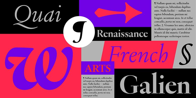
Galien是一种现代衬线字体,其灵感来自于15世纪开始并持续了一百多年的法国文艺复兴时期的字体。这是古希腊和罗马科学,艺术和文学的重塑时代。主流印刷术从印刷初期的原始Textura Blackletter模型转变为受加洛林式书写启发的人文字母形式,该字体在圣罗马帝国的古代手稿中使用。这是迄今为止影响我们阅读习惯的拉丁字体的一个决定性转折点,这里对詹森,马尼蒂乌斯,格里菲,加拉蒙德,格兰洪,霍金,维利尔等当代大师的打孔器的工作进行了总结,并翻译成二十世纪的数字字体Galien。 Galien并不是某个特定字体的复兴,而是一个时期的复兴。斜体字直接受到16世纪初期的威尼斯风格的启发。加利安(Galien)是各种旧样式模型的正确混合形式,塑造了当代的数字字体。调整后的尺寸可以很好地适应正文副本的大小,厚薄之间的对比仍然很明显,可以保持优雅。该系列的8种样式确保了小尺寸的可读性,而特殊的Poster剪裁则在更过渡的轴上具有特别高的对比度,并通过一些大胆的设计决策来影响标题,从而增强了这种解释的炫目性。为了实现当代使用,Galien的字符集非常全面,并包含了文艺复兴时期字体中不存在的字形:多组数字,小数,多种货币…等。这种设计的特殊性可能是特别是在斜体的波动角度中找到,使它具有人文主义的活力和温暖的感觉。罗马人的特点是略微的切口和曲线折断,使其更具决定性,并且与更加流畅和柔和的斜体字搭配得很好。读音符号和变音符号又细又高,让人联想到文艺复兴时期的字母的精致复杂性,并为欧洲语言创造了独特的对比。对于时尚和美容,艺术和文化,教育,设计和建筑项目而言,它将是一个完美的字体家族,并将在杂志,报纸和在线出版物中很好地发挥作用。
Galien is a modern serif typeface inspired by the typography of the French Renaissance that started in the 15th century and lasted for more than a hundred years. These were the times of the reinvention of the Ancient Greek and Roman science, art and literature. Mainstream typography moved away from the original Textura Blackletter model of the early days of printing to Humanist letterforms inspired by Carolingian writing used in ancient manuscripts of the Holy Roman Empire. It was a decisive turning point for Latin typography that shapes our reading habits up to this day.The work of the punch-cutters such as Jenson, Manitius, Griffo, Garamond, Granjon, Haultin, Villiers and other contemporary masters is here summarized, abstracted, and interpreted into Galien, a digital typeface of the twentyfirst century. Galien is rather a revival of a period than that of a particular typeface. The Italics are directly inspired by the Venitian types of the early sixteenth century.Galien is a well-dosed blend of various Old Style models that shapes a contemporary digital typeface. Tuned to perform well at body copy size, the contrast between thick and thin remains nevertheless quite visible to preserve elegance. While the 8 styles of the family ensure good legibility at small sizes, the special Poster cut enhances the flamboyance of this interpretation with a particularly high contrast on a more transitional axis with some daring design decisions for impactful headlines. To enable contemporary usage, Galien’s character set is quite comprehensive and includes glyphs that did not exist in the typefaces of the Renaissance period: multiple sets of numerals, fractions, a large selection of currencies… etc.The particularities of this design may be notably found in the fluctuating angles of the Italics giving it a Humanist vibrance and a warm feel. The Romans feature slight cuts and curve breaks making it more decisive and pairing well with the more flowing and soft Italics. Accents and diacritics are thin and tall, reminiscent of the delicate sophistication of the Renaissance letters as well as creating a unique contrast for European languages.Galien will be the typeface of choice for setting highly readable texts as well as beautiful titles in projects where elegance and style are a must. It will be a perfect font family for fashion and beauty, arts and culture, education, design and architectural projects and will work well in magazines, newspapers and online publications.

评论(0)